This article was first published in the HDR one magazine, but here you have a version with few more photos :)
Composition
Composition is the most important part in any photo. It the same in regular as in HDR photos. It’s not that simple to learn how to see good composition, but there are few simple rules that you can follow to start with.
I personally use these rules all the time, but I don’t think about them anymore. I search for a view that is visually pleasing to me, and that view just fits the rules. You will notice, that if you look at your own photos you like, you will find many of these in it. Composition is really something that is hard to teach. This is my view on it, and I hope it can help some of you.
Lets start with few of my photos I think are composed nicely
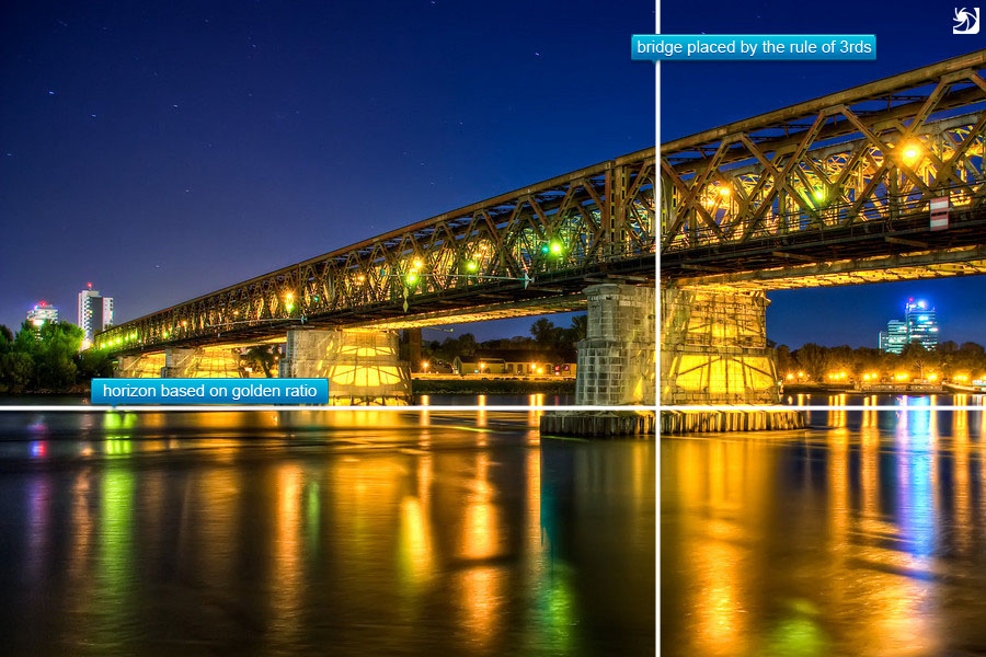
1. Forget about the Rule of thirds
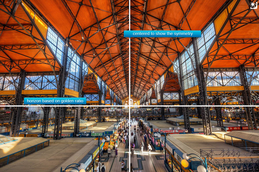
Seems a little different that most of the photographers say, but my reasoning is simple. If you do something, do it right. Rule of thirds is the simplistic approach to compositions. Instead of it use the golden ratio rule. I used to go by this rule for a long time, and now I really wish I switched sooner. Sometimes happens to me that I use it, when the scene fits it more, but very rarely or only partially (for instance horizon on the golden ratio rule, vertical split based on the rule of 3rds).
Just so you know whats the rule. It means placing the subject of your photo on one of the intersecting points or lines splitting the photo into thirds.
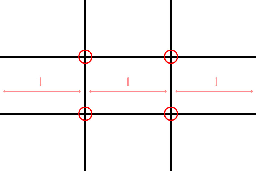
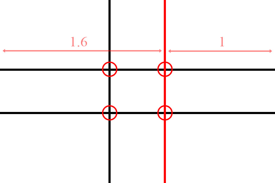
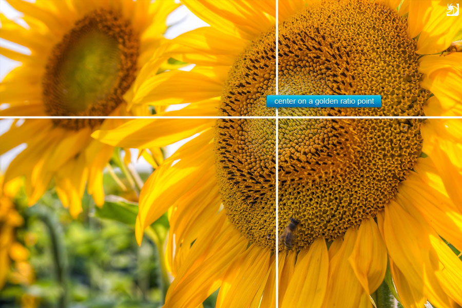
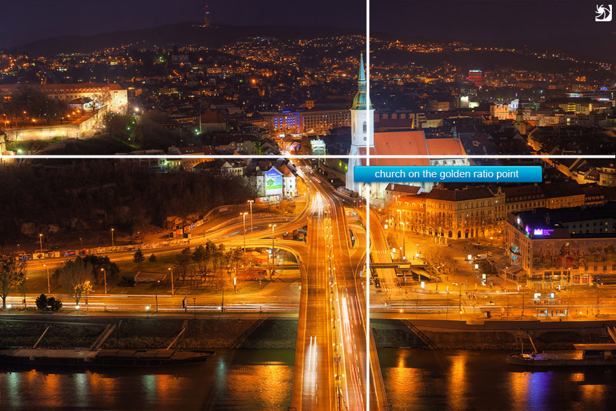
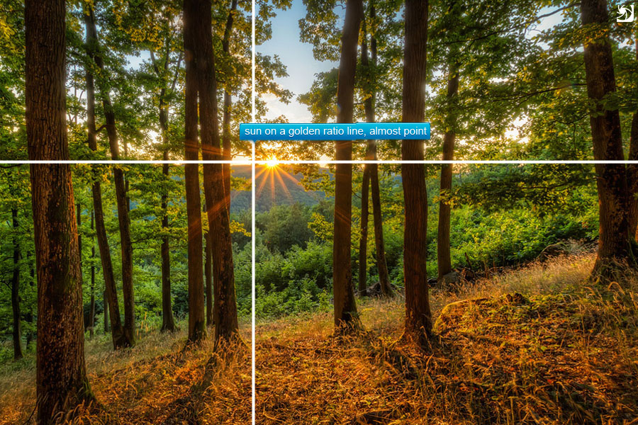
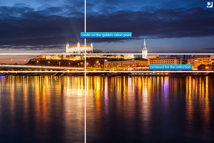
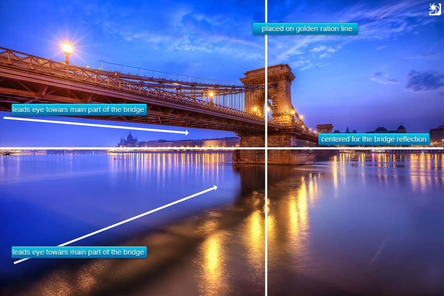
2. Use the golden ratio
So here you can see my reasoning. If you shoot regularly, and you use the rule of thirds, over time you will tent to move towards the golden ration rule. So why not skip the first step completely. As you shoot you will notice that you start to use it without even thinking about it. The difference is subtle, but noticeable. This ratio is based on golden spiral (or Fibonacci Spiral) but it’s easier to looks at it as a grid. The photo is always split in 1.6 to 1 parts. Same as by the rule of thirds, you place the subject of you photo onto a line or onto a intersecting point. You don’t have to be pixel perfect, if you are a little off, it’s not really a problem. You can correct it by cropping or do as I do, leave it be as it is.
For all of you who use Lightroom to crop your photos, you can switch your crop overlay to a golder ration one or a golden spiral one by going to Tools>Crop guide overlay or by pressing O few times. It makes the cropping much easier.
Examples for the use of the rule
3. Don’t center your subject
Really don’t do it. Your photos will look more like snapshots, not photographs. Centering has it’s place in fotography, in special instances (look on the next point) but in most it is out of place. Photos like portraits, irregular shapes, landscapes and much more looks really strange when centered. No examples here as I really try to avoid this.
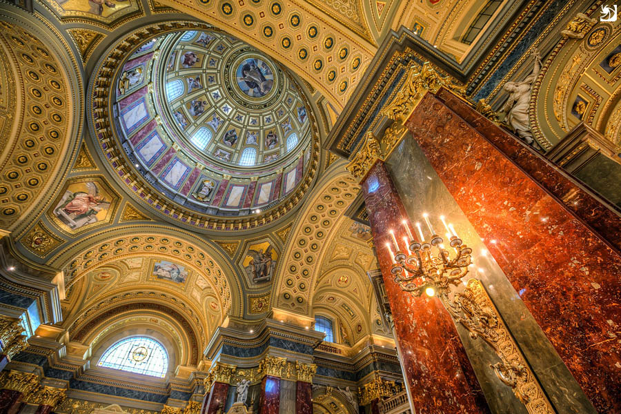
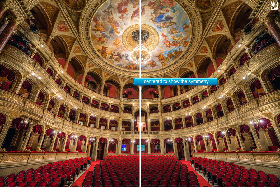
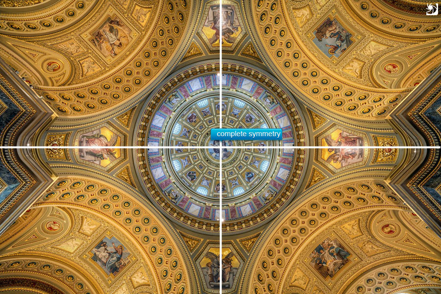
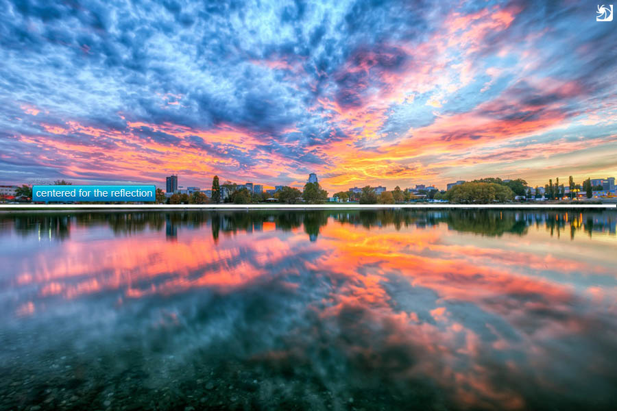
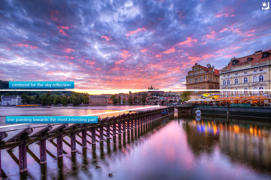
4. Center your subject
As all rules, there are exceptions. For me the two main reasons to center a photo:
- symmetry – symmetric scenes look great centered. Cathedrals, arches, tunnels.. anything symmetrical. Just center it. But be sure you center it exactly. When you get it a little of center, it will distract the viewer and the overall feel of the photo will be worse. This is much more visible when you use a wide-angle or a fish-eye lens. Even if you stand only few centimeters of the center it will look wrong to the viewers eyes. Try to use live-view on you camera to visualize the final photo and guide yourself by mirrored elements in the scene to get the perfect symmetry. It can be partially corrected in post-processing, but not always.
- reflection – has also a lot to do with symmetry. For me this one is just natural. If you cut off a part of the reflection , because you wanted to avoid the centering, it will look aukward.
Examples for the use of the rule
5. Combine different rules
Why not have a photo symmetrical horizontally and adhering to the golden ration rule vertically. You can use everything at once.
Examples for the use of the rule
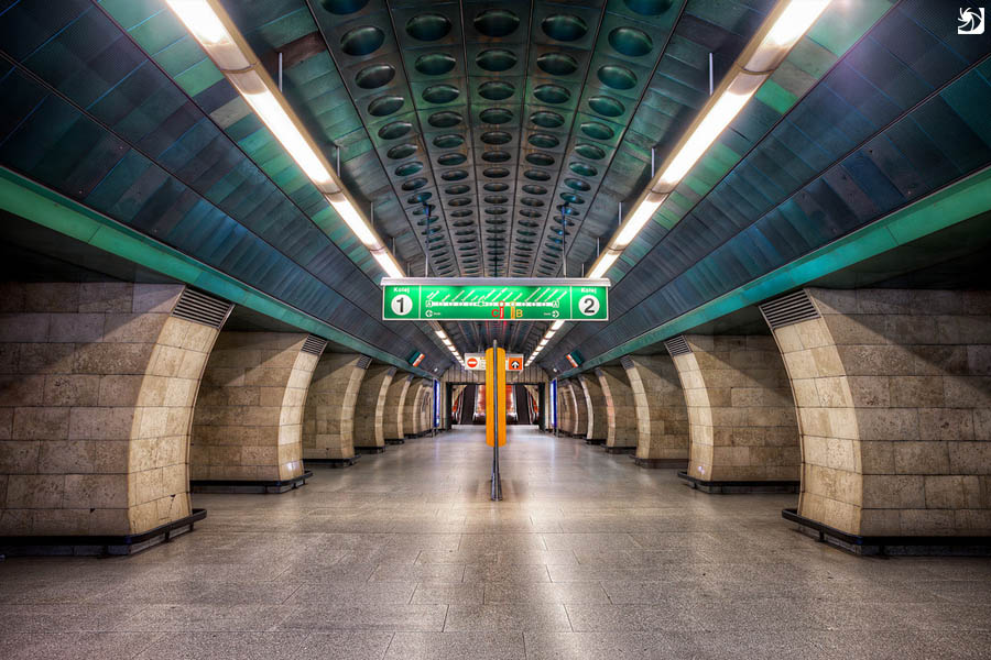
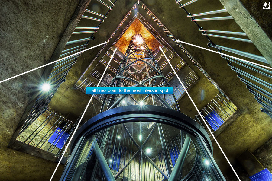
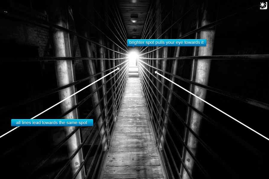
6. Use leading lines
The viewer eyes ten to follow lines in the photos. If you position your main subject so, that all lines in the photo lead to it, you will get a visually pleasing photo. Lines like road signs, power lines, train tacks and similar, are great for this. Just look around your subject, and you will find some.
Examples for the use of the rule
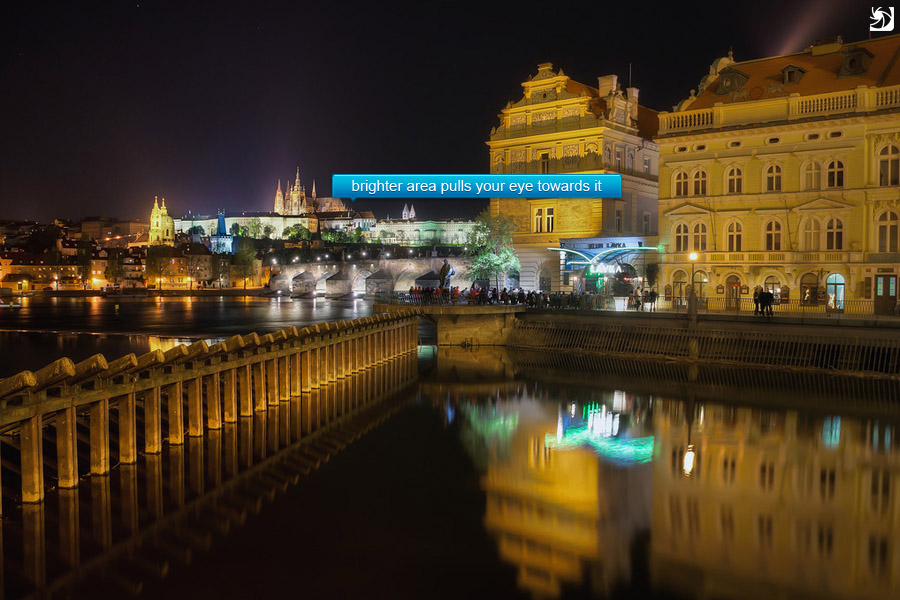
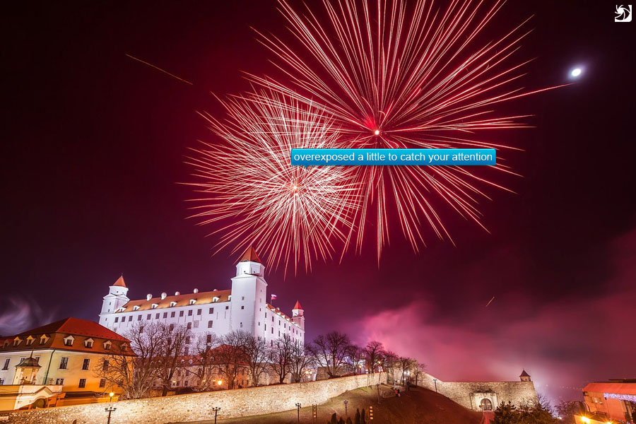
7. Use leading light
Similar to leading lines, you can also have what I call leading light. By this I mean brighter areas in your photos. If you leave only one part of your photo brighter then the rest, the eyes of the viewer will be imediatly drawn to it. So it really should be your main subject. This is very visible in high contrast scenes, mostly in night photos.
Examples for the use of the rule
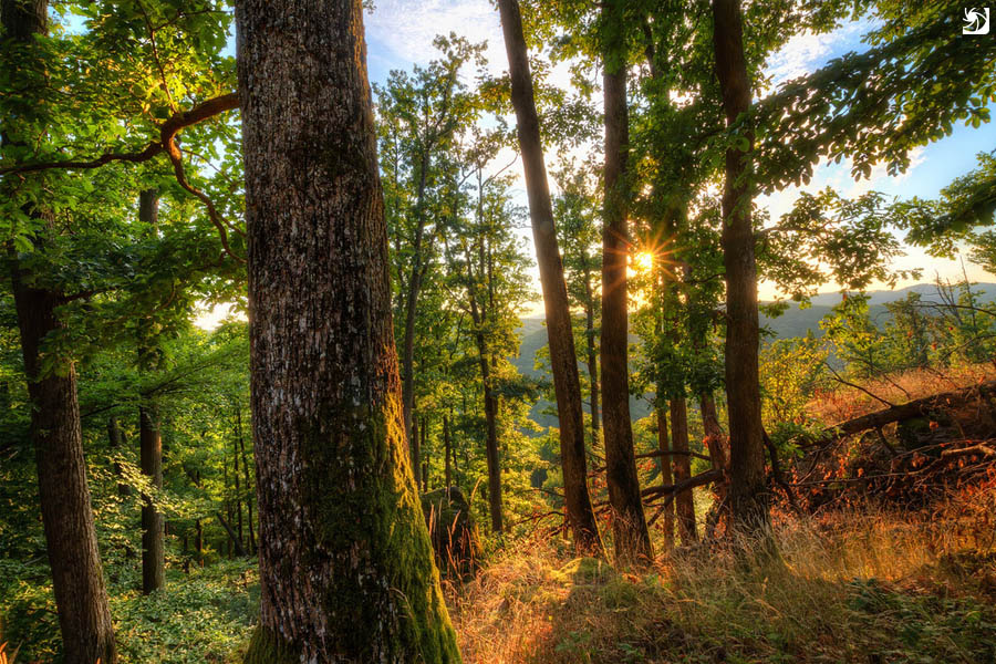
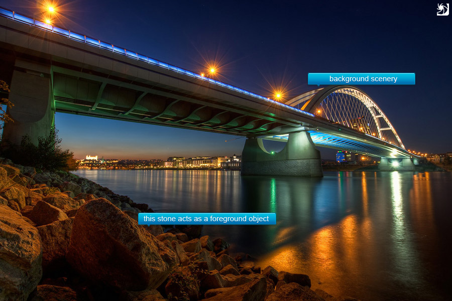
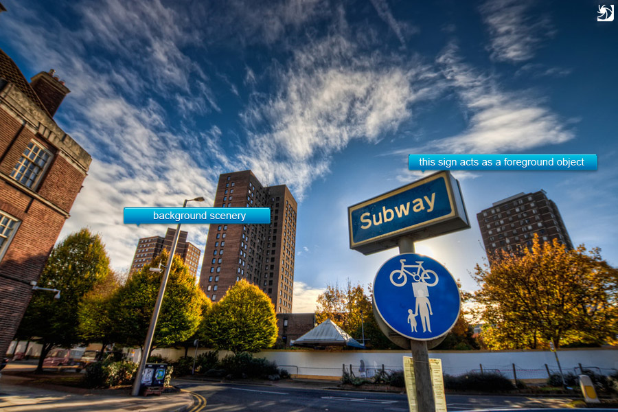
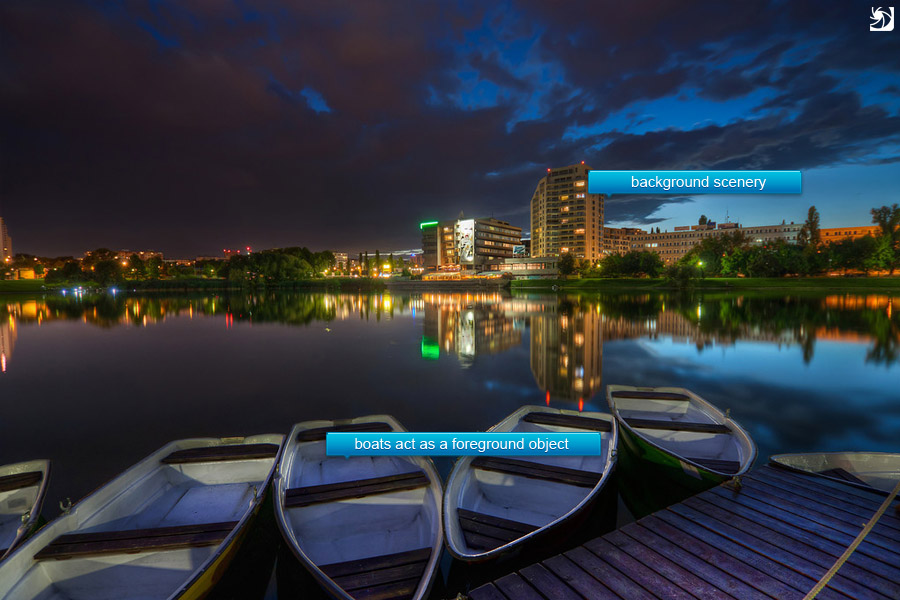
8. Add a foreground object
This is something which you can see all the time paintings. You should try to have foreground, middle-ground and background in your photo. I try to have at least a foreground and a background element. This is not always that easy, especially, when you are trying to capture a landscape photo form a higher location. But one should try. Having a foreground element gives you photo a sense of scale and depth.
Examples for the use of the rule
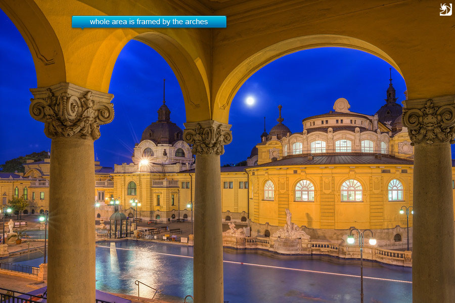
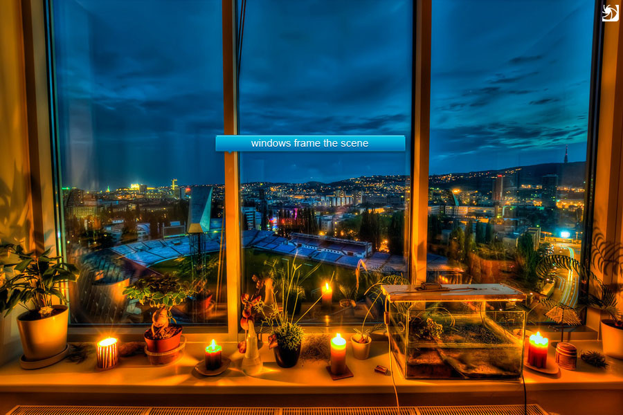
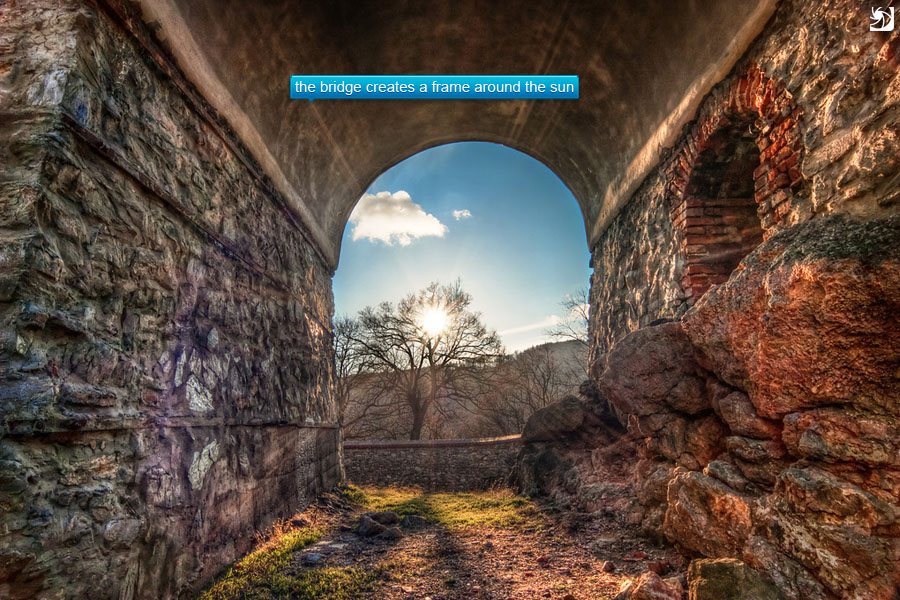
9. Frame your subject
It’s sometime very nice to add a frame around your photo. By this I don’t mean those frame effects you find in some applications, but a different object, which surround partially or completely your subject. For instance leaving the window in your photo when you are shooting from inside out, or shooting through a tree when taking a photo of a house.
Examples for the use of the rule
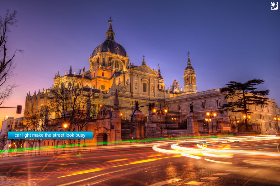
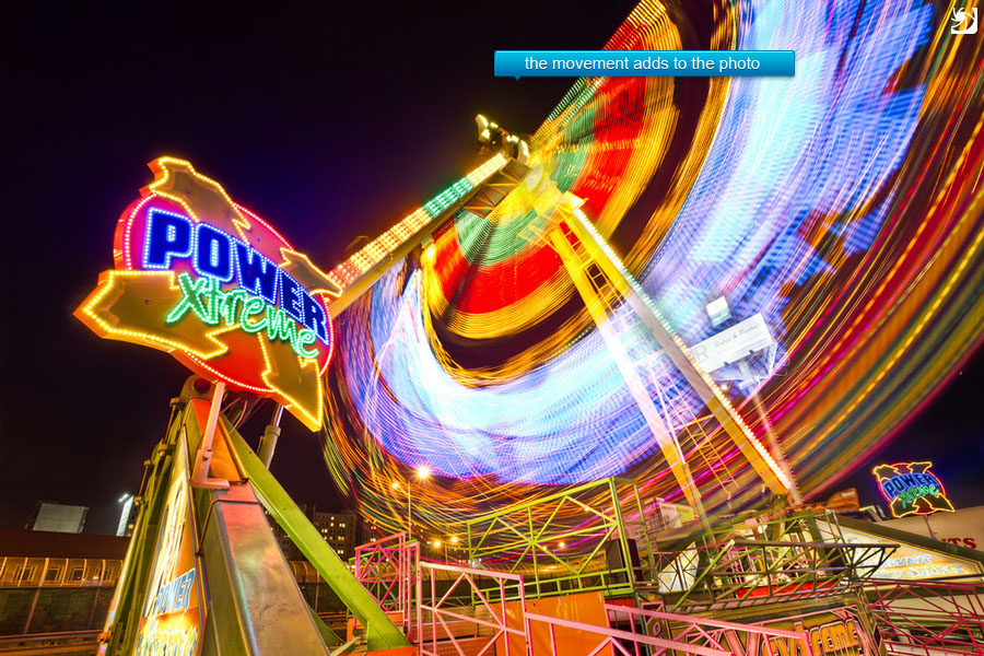
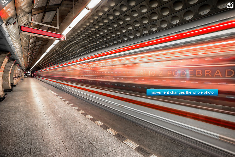
10. Add a sense of movement
Especially in shots when one would expect movement (busy streets for instance) a blurred car or person can give more drama and life to the photo. You will loose this “frozen” look, a lot of photos have. I do this more with moving objects than people. Cars, trains, metro, water and similar objects can be used to archive this.
Examples for the use of the rule
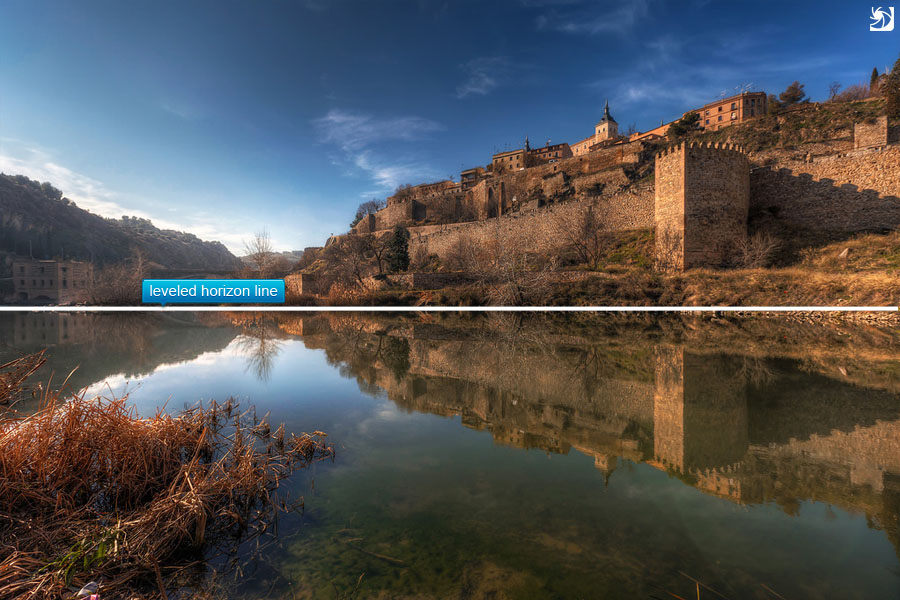
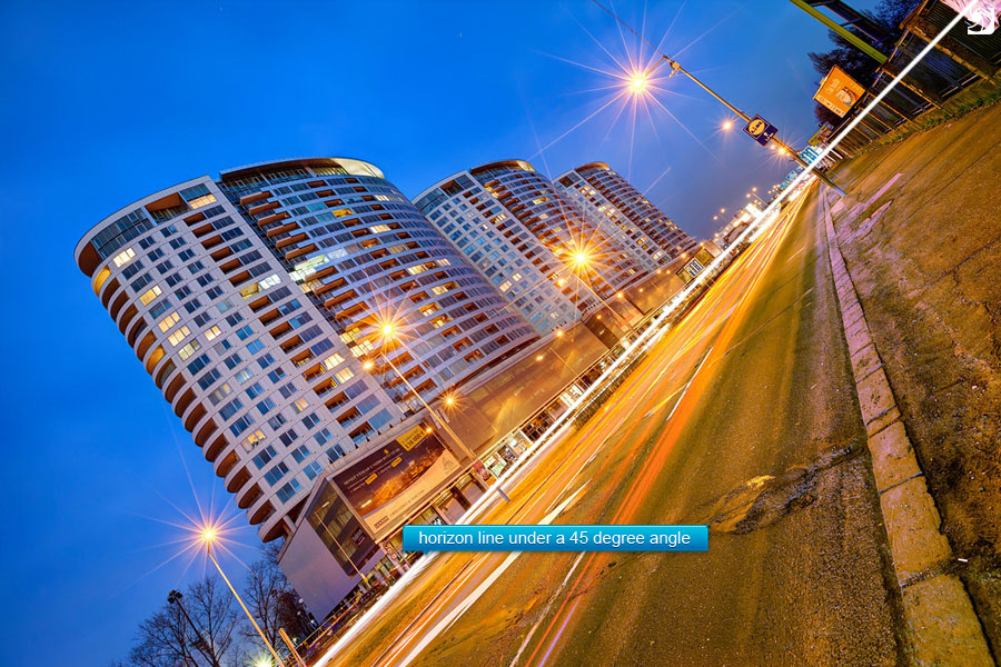
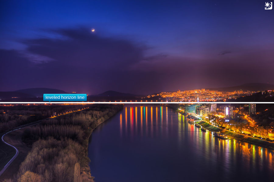
11. Level your horizon (or don’t)
When you shoot a landscape photo a leveled horizon is really important. A crooked horizon will look very distracting and makes the photo look rushed and sloppy If you want to have a crooked horizon, go for an angle at least around 30 degrees. At that point it is obvious that you intended to make a crooked image and it no longer looks like an error.
Examples for the use of the rule
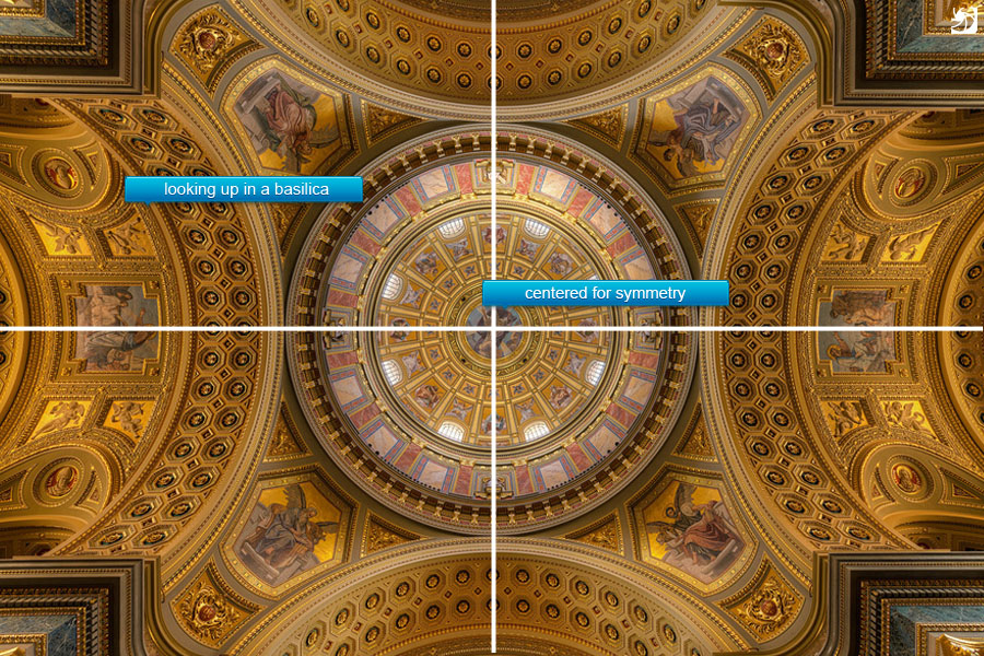
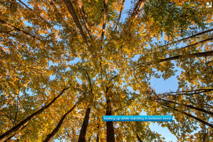
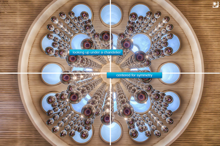
12. Look up
This is more of a tip, than a rule, but I noticed that a lot of photographers miss this. When you are at an interesting place, try to look up. Very often you will get a very interesting view and composition of the surrounding area. Looks even better if you use a wide-angle or a fish-eye lens.
Examples for the use of the rule
13. Ignore everything I mentioned here :)
Rules are nice and all, but don’t be limited by them. Just take the photos you want and maybe your style will one day be copied by all other photographers :)
I will end this with two more suggestions. First, try composing you photo directly in camera. If you relay to much on cropping, you will loose too much of what you are trying to capture. Secondly, use a tripod. Using a tripod forces you to slow down and think more about the photo. It’s no longer just point and shoot.
The blue Danube
Taken at the one of the Top 5 Spots in Bratislava I mentioned yesterday. Really great one for reflections. I also did a lot of masking on this one, as I wanted avoid the ice look for the water. So I just placed one of the original shots over the HDR and then lowered it’s opacity, until I liked the water, and then added a mask, so it only affects the water.