When one takes and edits photos, one has to look at them from many different sides. Even it its the use of HDR, composition, sharpness, color, and much more. But a lot of times, one forgets to take into account, the human brain. The think I have in mind, is, that the human brain works in relatives, not absolutes.
This is simple. You never looks at anything on it’s own. Your brain always compares it with something else. A simple example would be money. If you have to spend 10 more on something that costs 1000, you perceive it as a small amount. If it’s 10 on something that casts 50, it looks quite a lot. But if you think about it, the 10 is same in both instances.
Another typical, more visual example is this. Look at this image, and think about which square looks white? Of course it’s the second one.

But let’s add another square next to them. Which one looks white now? The third one. How can this be, when the first two haven’t changed? Simply. You brain compares the square with the ones next to it, and when it finds something brighter, it declares that to be white.

(it’s not so visible if you look at both images at once, as the brain takes both into account :))
So how this applies to photo? Creating contrast between two areas, will exaggerate what you want to show. Let’s look at few situations:
 1. More sharpness – Just think about, when does something looks sharp? When there is something less sharp next to it. You can see this especially in photos with bokeh background. Just by having the background blurred, makes the the foreground pop up more, makes it look much sharper. If you make everything sharp, this contrast effect get’s lost, and everything looks less sharp.
You don’t even have to go the way of a blurred background. Just having parts of the photo sharpened a little less, is enough. Or even just having less detail. Your brain will see the difference.
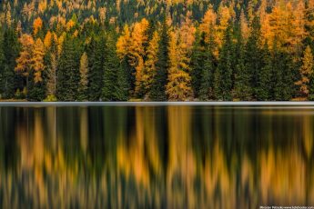
2. More color – Same as with sharpness, you can make something look more colorful without adding saturation. If you lover the saturation of the surrounding area, it will just look colorful on its own. This is actually also the reason, why sometimes part of a photo may look over-saturated when they are not. You just compare them with other parts of the photo, and it may seem that way.
3. More brightness – This is why most pages view photos on a black background. The photos just look brighter compared with it and more vibrant. But you can see the same effect directly int he photos, where parts may look bright even if they aren’t.
And I could continue like this. The main point is, that if you want make something more dominant, try having it next to something that’s completely opposite to it :)


Leave a Comment