One of the steps I do almost in each photo post-processing is adding a little bit of glow to the photo. Glow softens the photo, adds contrast and saturation and overall makes the photo more pleasant to the eye.

There are multiple ways you can add glow to your photos (for instance Glamour glow preset in the Color effex pro plugin), but I personally prefer to do it just using Photoshop. It’s very simple and requires only two layers to apply. I went step by step in my description, but for those who are lazy to go through it, I also created a Photoshop action for you, which does all of this for you. You can download the action from here:

HDRshooter glow Photoshop Action

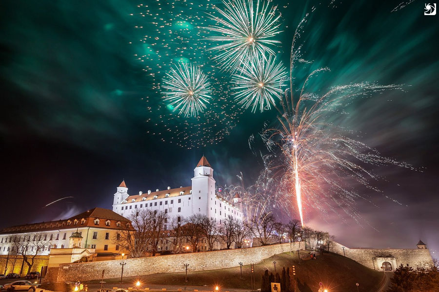
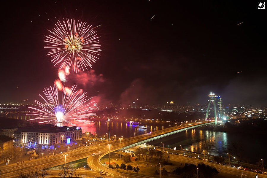
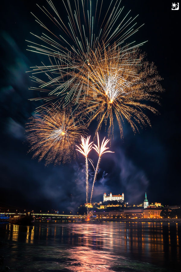
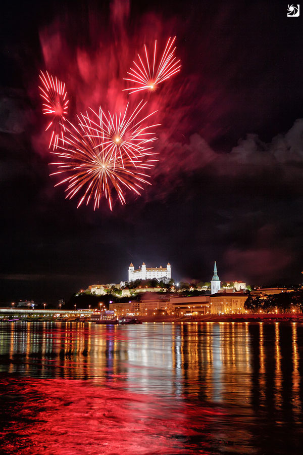
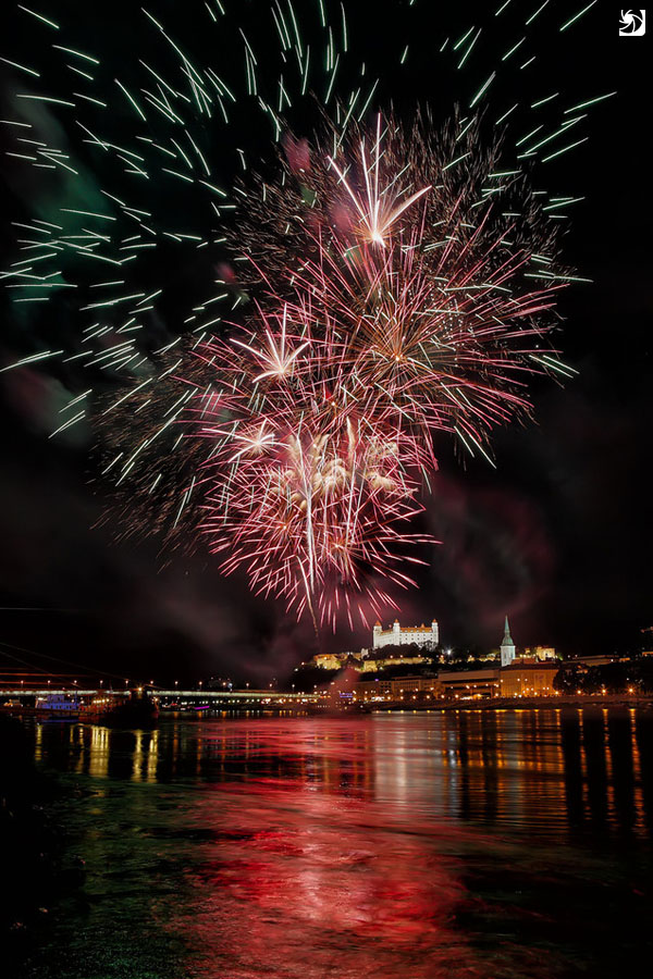
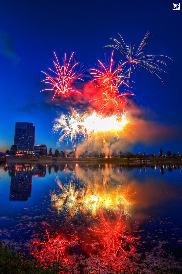
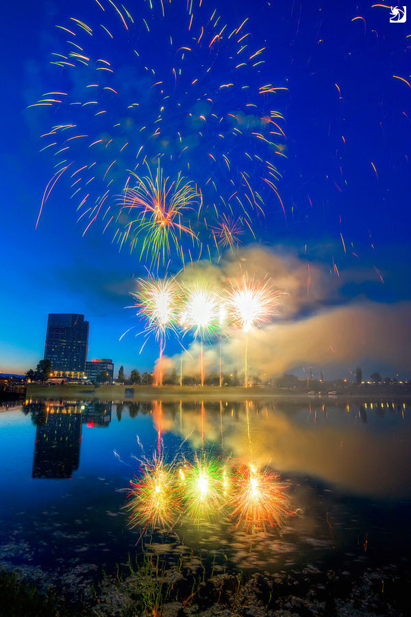
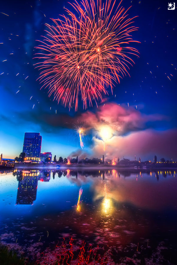
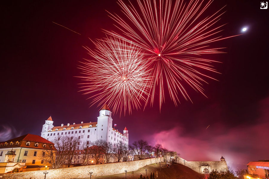
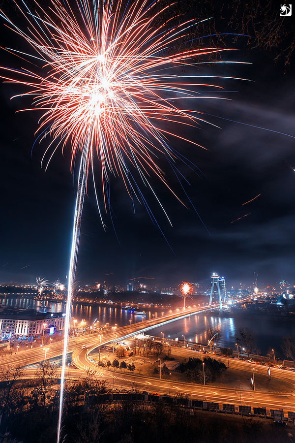
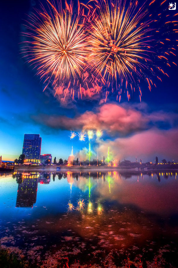
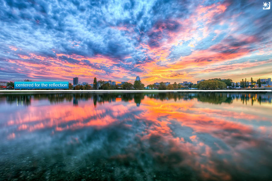
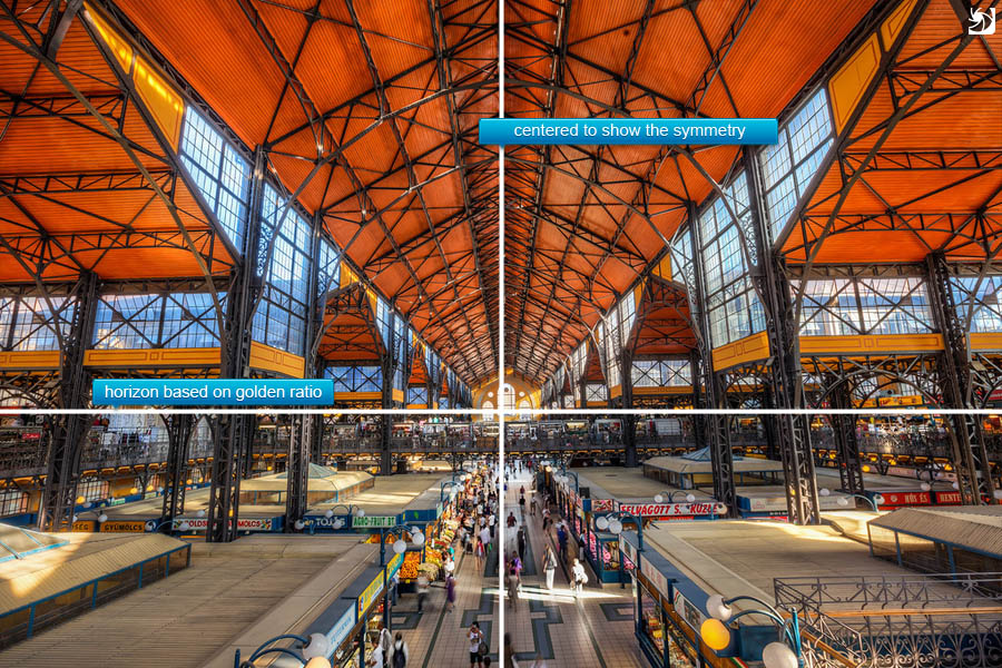
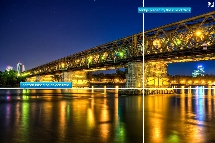
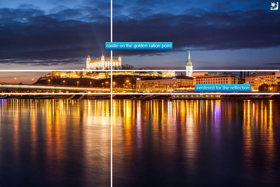
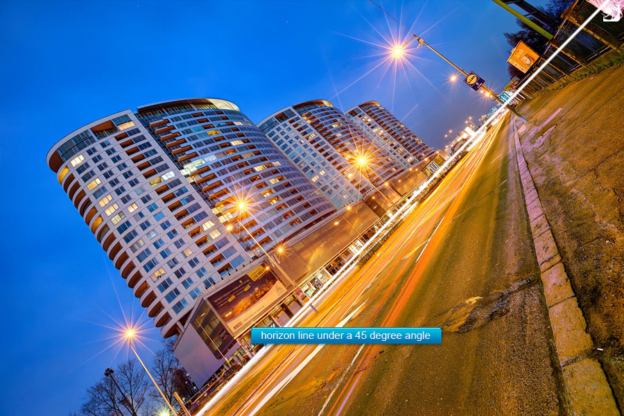
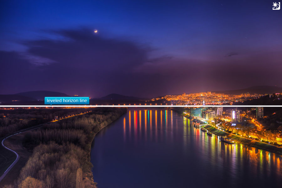
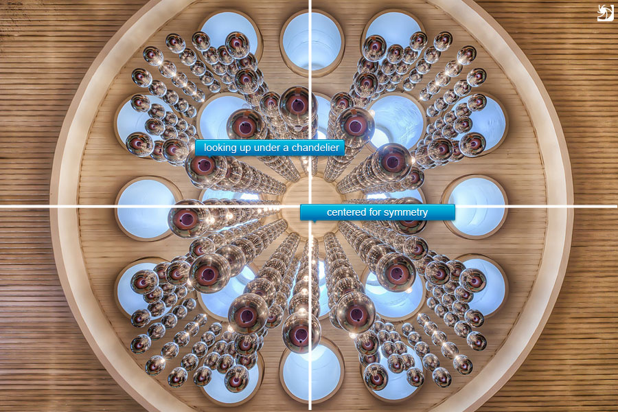
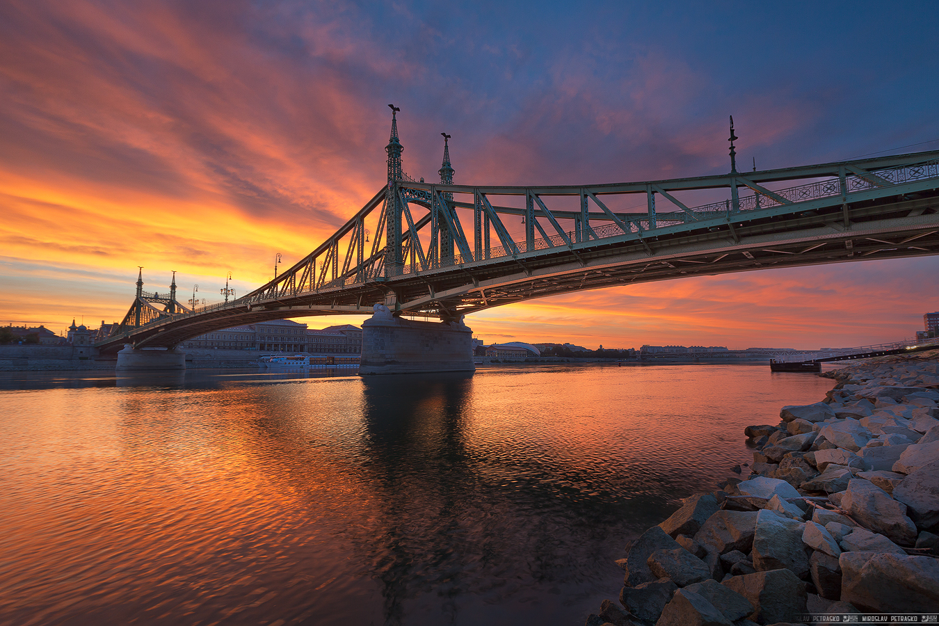
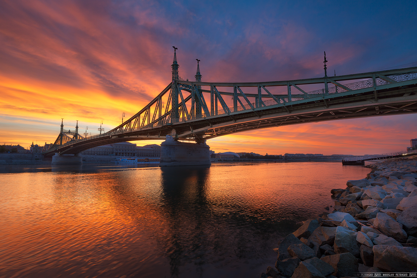
So lets take a look at this photo (I suggest clicking on the photos to see them bigger, to see the difference better):

glow-0 glow-25 glow-50

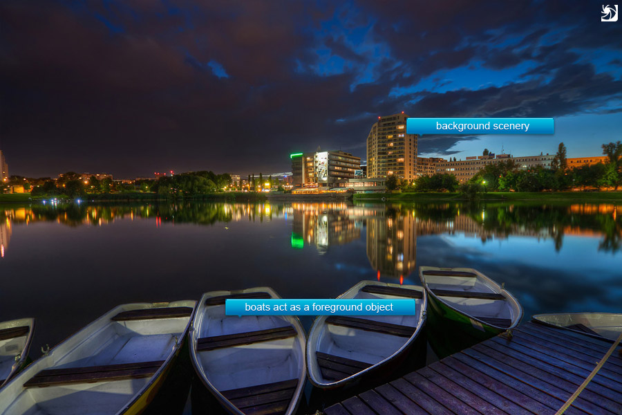
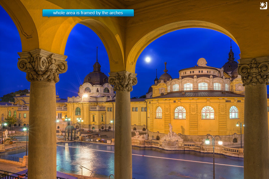
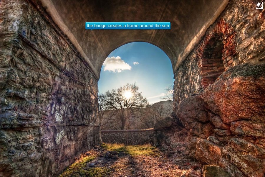
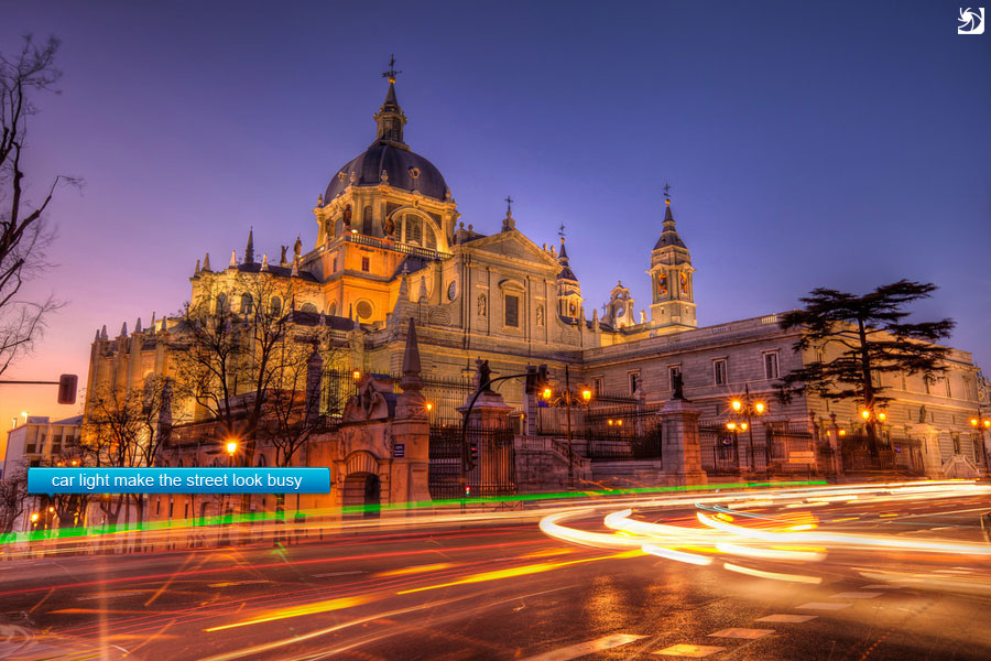
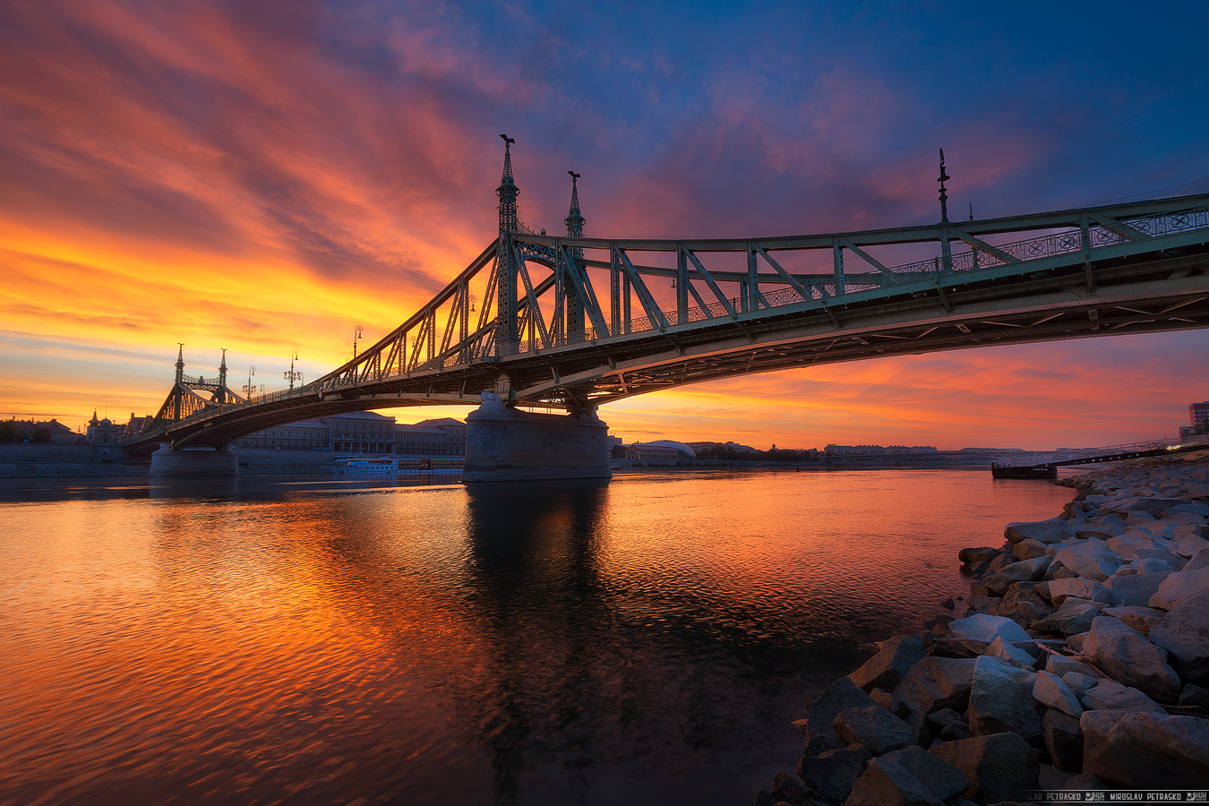
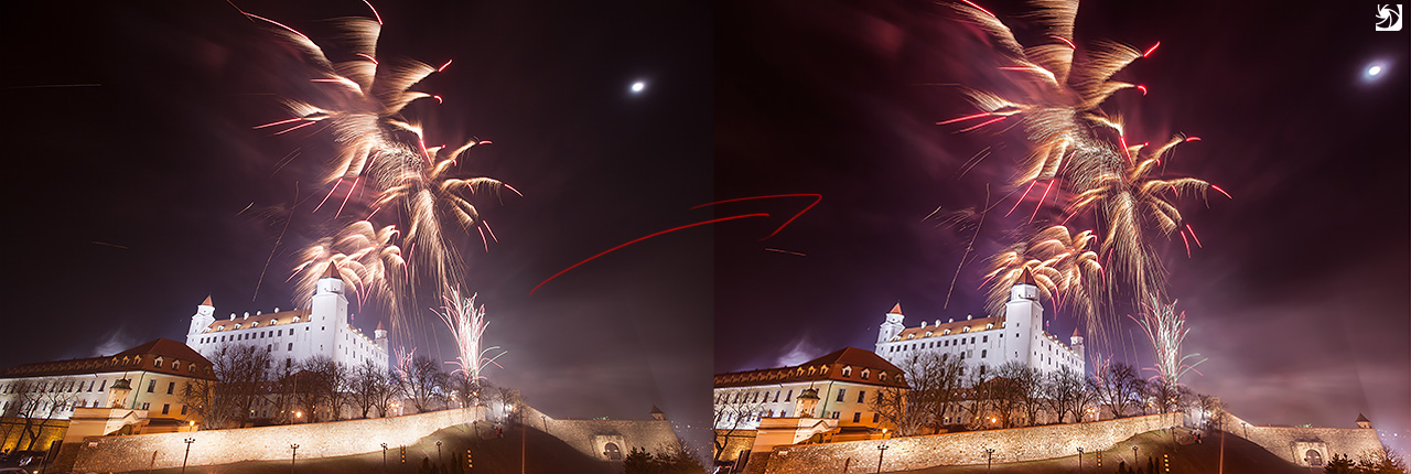
The first one has no glow added, the second one has the glow on 25% and the third one on 50%. You can see the difference in contrast, softness and color here. You can also see that glow will darken the very dark areas and brighten the very bright areas, so this is something one has to take into account here.

How to add glow?

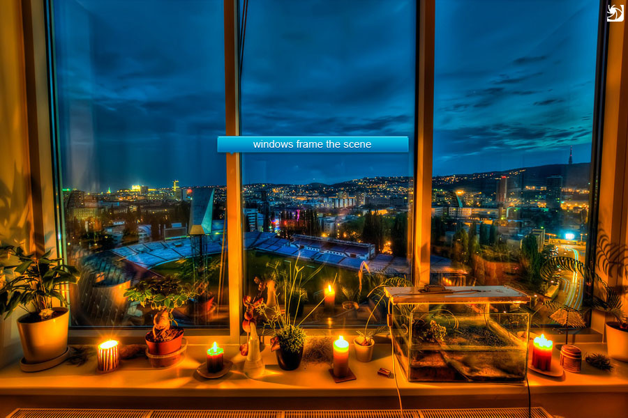
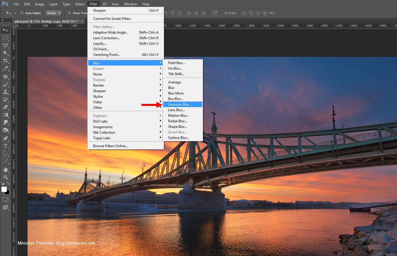
So how do you add this glow. Lets start with a photo in Photoshop:
glow-01

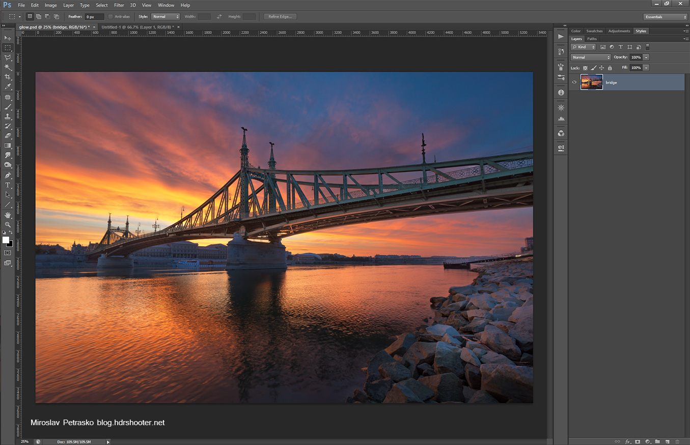
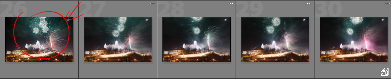
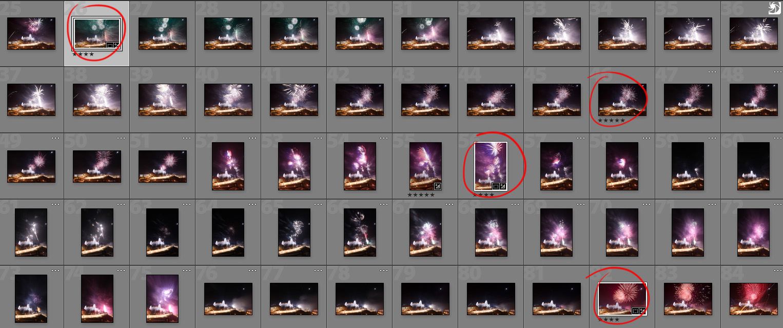
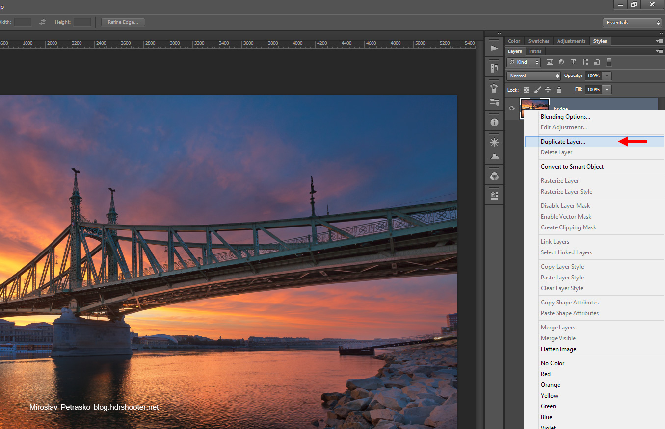
Our fist step is to duplicate this photo (if you have a file with multiple layers, just merge them into one new layer). To duplicate, right click on the layer and select duplicate layer
glow-02
glow-03

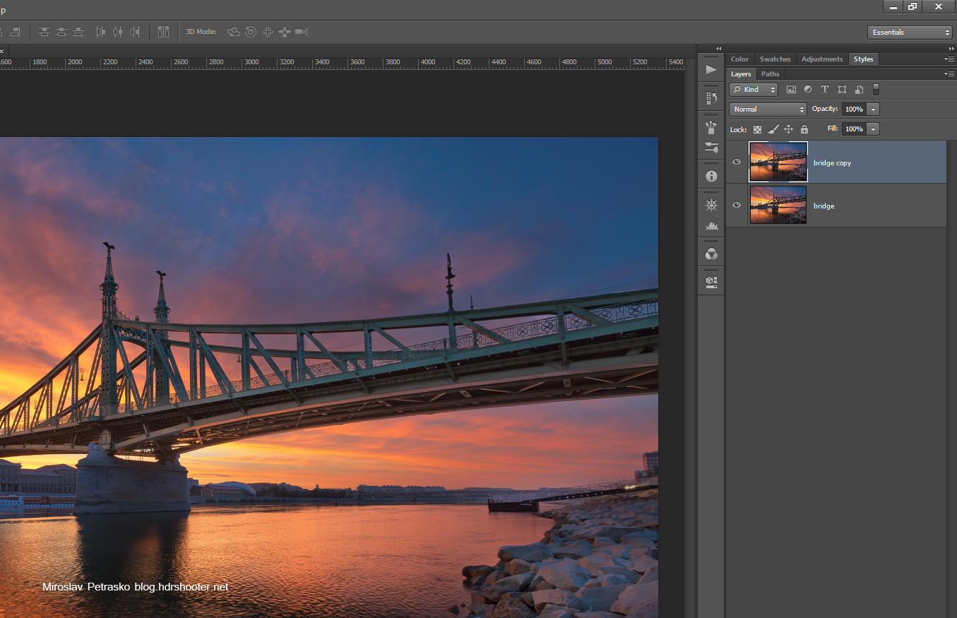
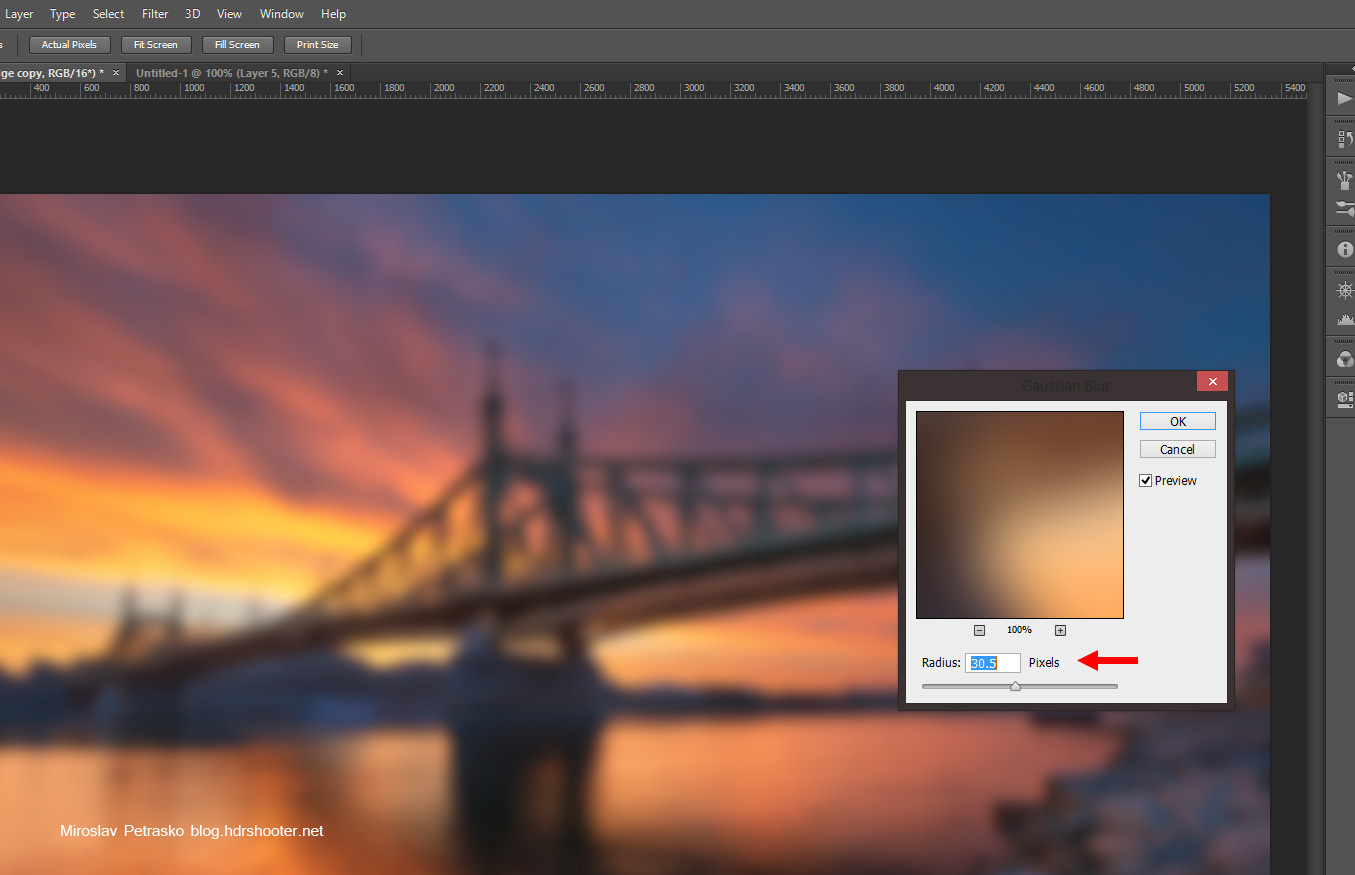
Next select the new layer and blur it. Gaussian blur works very well here. I usually go for a 30px blur, but it greatly depends on the size of your image. For my 20Mpix images, 30px works well. If your images are smaller, you should use less blur, for bigger images you can use more.
glow-04
glow-05

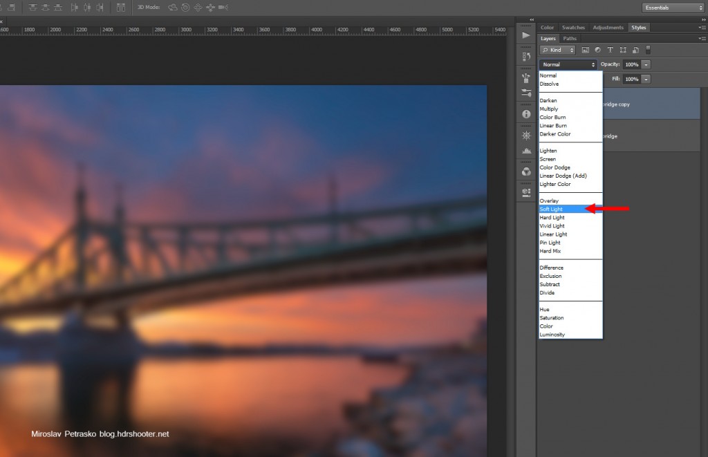
Now we have to change the blending mode of this layer. While the layer is still selected change it to soft light
glow-06

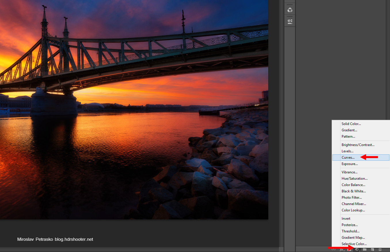
You can see the photo now completely changed, but it a little bit to dark, so we need to brighten the effect. I use for that a new adjustment layer. You can use anyone, but I prefer Curves, as I can add more contrast if needed. So choose new adjustment layer and curves
glow-08

And then change the blending mode of this new layer to screen. This will brighten everything under it by one stop.
glow-09
glow-10

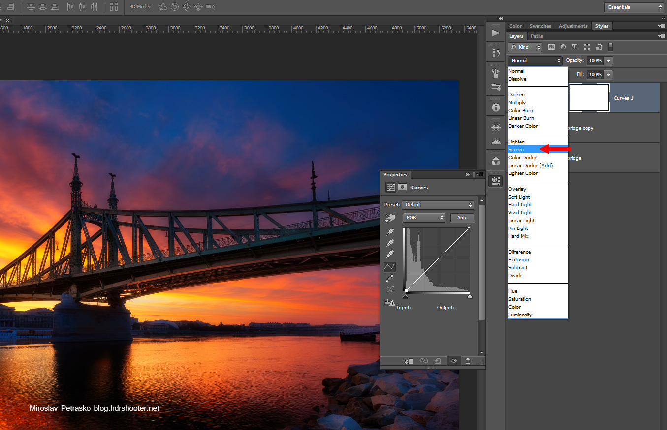
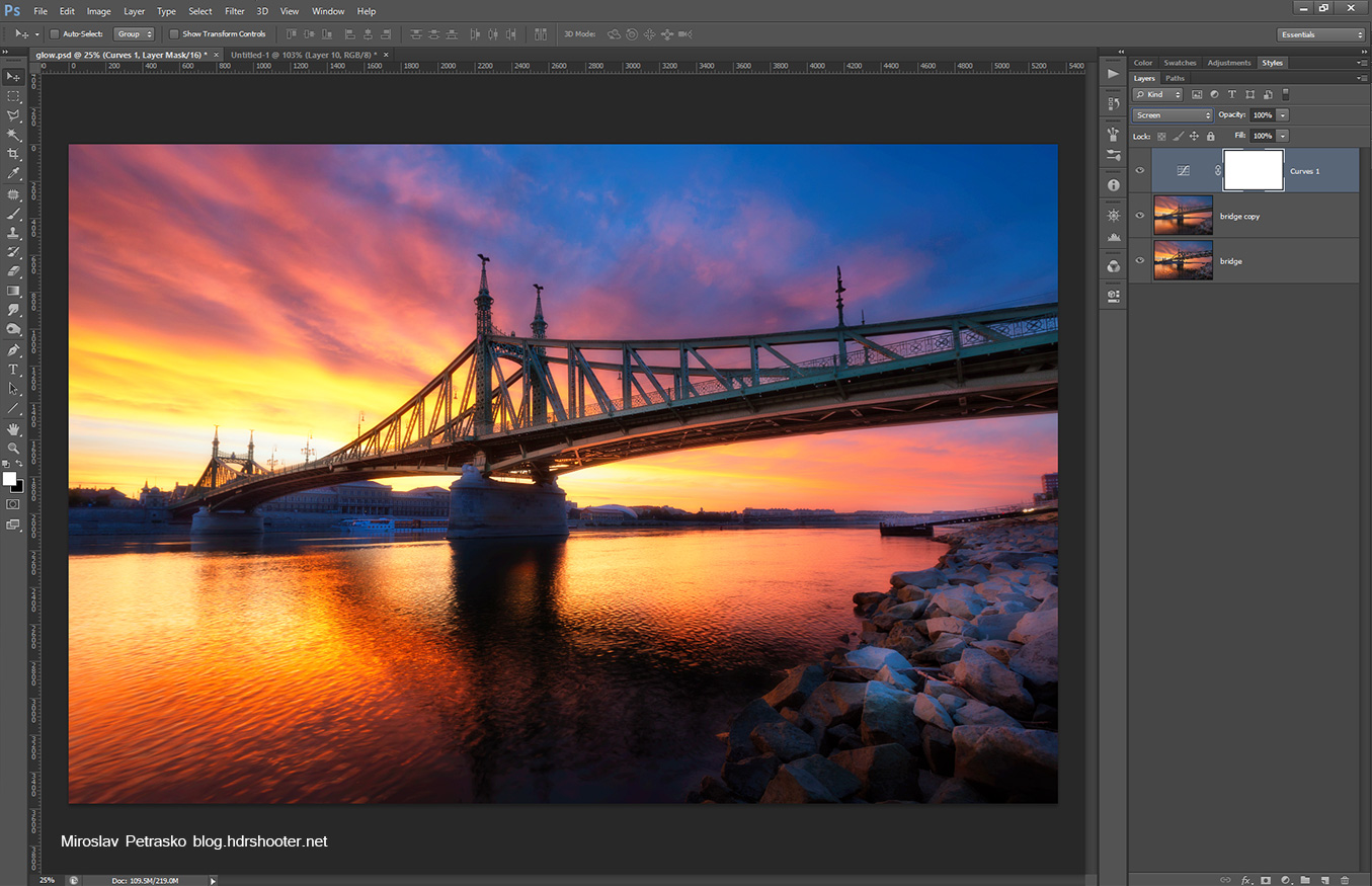
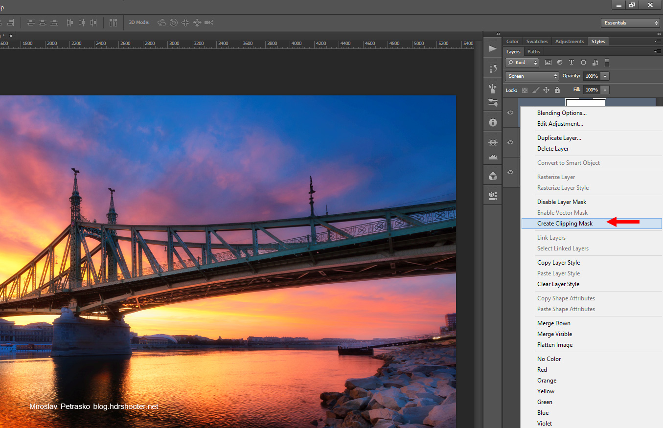
The result is now better, but the curves layer effects everything under it, and we need it to just effect the glow layer. To do this, right click onto it and choose Create clipping mask.
glow-11
glow-12

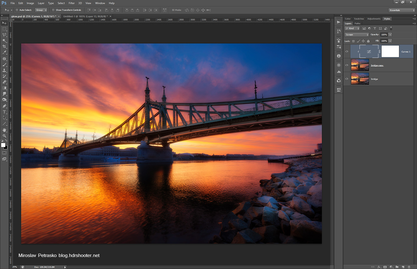
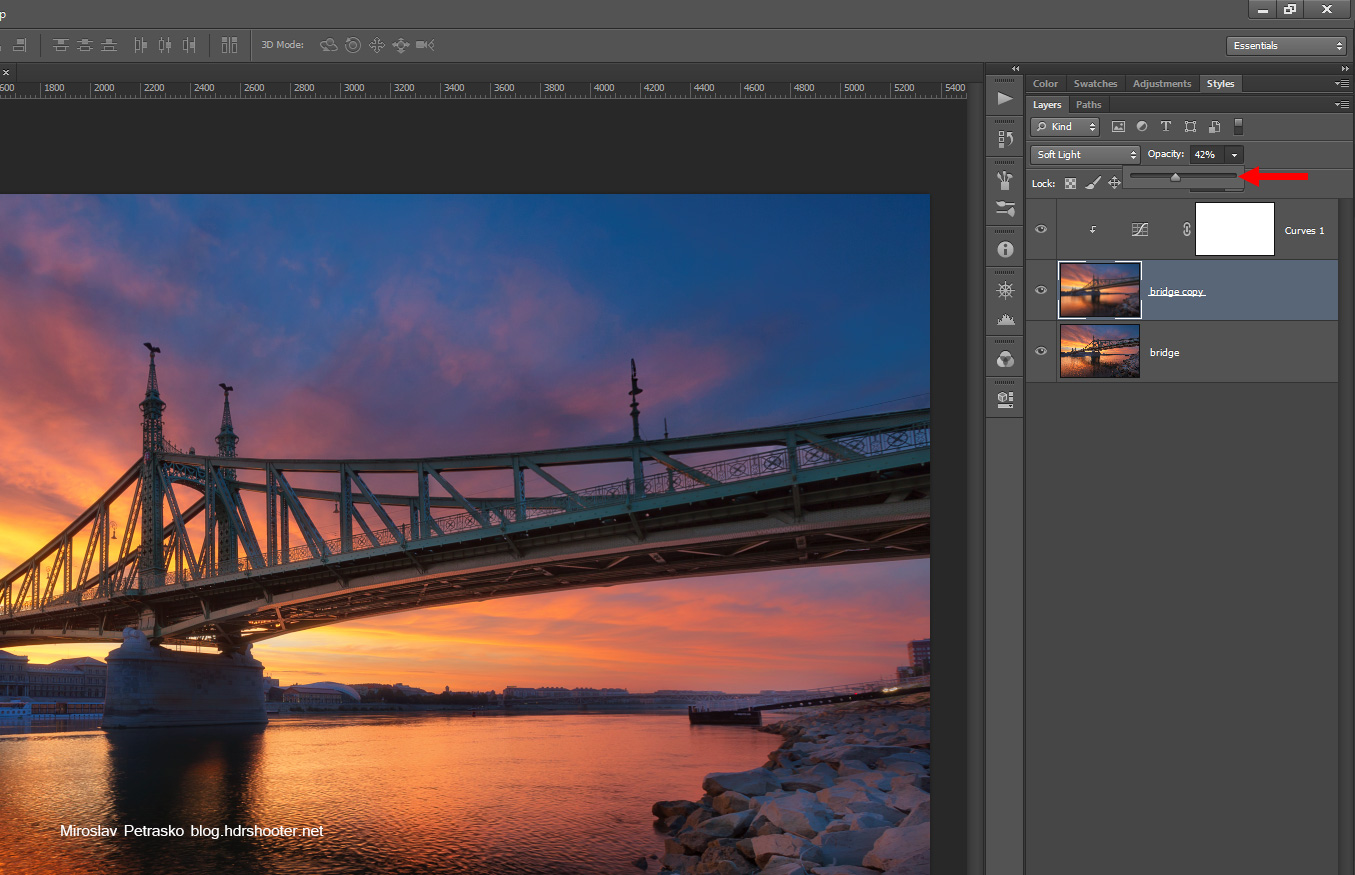
As a last step we need to change the opacity of the glow layer. The higher, the stronger the effect is
glow-13

You can also add a layer mask to the glow layer, and only paint it onto the areas where you want it (or remove it from the areas where you don’t need it).

And that’s all. The photo now has a nicer contrast, nice glow and much richer colors. It can happen that the photo will be a little to dark after this, but that’s can be easily corrected.

Feel free to ask any questions and don’t forget to download the provided action :)

HDR panoramas

As I started shooting panoramas and HDR panoramas, I was trying to find the best workflow how to combine the photos into a panorama. I seen two main approaches to do this. First one is to first merge/blend the HDR image for each part of the panorama, the second is to first combine the panorama and do the HDR processing later. After a lot of experiments, this workflow worked the best for me.

I will be using Lightroom and PTgui in this guide. If you want to know how to do the same thing using Autopano, please view this HDR panoramas with Autopano guide.

Select the photos you need

First find all the photos from the panorama, you want to use. Select them all in Lightroom and choose develop.
pano01

Enable profile correction

In the develop module modify any settings you need (noise reduction, white balance and similar) and then under Lens correction/Profile select Enable profile correction. This will remove lens distortion and lend vignetting, which will make the the blending of the panorama shots together easier and you will avoid having shadows where the blends are.
pano02

Remove chromatic abberations

Under Lens correction/Color select Remove chromatic abberations. This is not required, but it’s much easier to remove them now, than to try to do it later. After that, choose the Sync button and sync all the settings to every selected photo.
pano03

Export the images

Now you can export the images. Choose File/Export. I suggest choosing a new folder, where all your images will be stored. Then so you have the best quality export, choose Image format as TIFF, ProPhoto RGB and 16bit colors. Hit export.
pano04

you will end up with all your images exported as 16bit TIFF files in the folder you selected
pano05

Load the files into PTgui

Now open PTgui and load all the exported images into it
pano06

Choose Align images

You don’t have to wait until all the image previews are loaded, just hit Align images
pano07
Now you will be given an option if these are HDR brackets or not. If you don’t get this options, there could be multiple reasons for it. Either you don’t have all your brackets loaded (e.g. you have one 5 bracket series and one 4 bracket series loaded) or the exif data does not match (e.g. one series +2ev is 20s, the second is 25s). In this case PTgui will not be able to combine them. Just try to add the missing brackets, or remove the ones where the exif does not match and you are good to go.

If you shoot your brackets from a tripod, choose the first option, if handheld, choose the second. You can have any HDR method selected, as we will not use PTgui to merge the HDR.
pano08

Correct your panorama if needed

Once the alignment is complete, you will see a preview of the panorama. Here you can correct the alignment of it. I suggest looking through the PTgui tutorials on their page to learn more about it. But usually you don’t need to do anything. Once you done here, close this preview window and choose Create panorama.

Btw. don’t worry if the photo here looks strange. PTgui can’t display 16bit files, so the colors and contrast will be quite bad. But our goal here is just to get good panorama alignment, nothing else.
pano09

Save blended planes

Once you hit Create panorama, you will be presented with this dialog. Here you have to choose how you want to save your panorama. You should select:

  • click Set optimum size and choose Maximum size
  • select TIFF as file format
  • click the format settings and choose 16bit, Packbits compression and no alpha channel
  • choose blend planes
  • click on Create Panorama

pano10
Now PTgui will save your panorama. We have chosen blend planes, so each brightness level is saved into separate file. This takes usually a lot of time, but after it’s done, you will end up with the same number of panoramas as you had the number of brackets for your HDR.
pano11

Continue with your HDR

Now you can continue as if you combined a normal photo. You can use any technique to combine this shots. Tonemapping in Photomatix, manual blending in Photoshop or any other. Just be prepared that if you have a slower PC, this will take a long time, as these panorama photos are very big.

I personally finished this photo with manual blending in Photoshop
pano12
and got this final image
After the rain in Prague

Hope you find this guide helpful and feel free to ask any questions

This article was first published in the HDR one magazine, but here you have a version with few more photos :)

There is also an extended version made into an eBook available, and its free for all the newsletter subscribers. Check more on the newsletter page.
book-preview

Fireworks

Fireworks make a quite special category in photography. Most of us  have very few opportunities to take photos of them and they tend to be over so quickly, that you can’t really change much once they start. Knowing what you are doing, knowing exactly how to control your camera, and arriving early on the spot are the most important thing you can do, to get a good photo of them. But let’s take a little closer look at taking photos of fireworks.

You will also notice that photos in this article are only from few occasions. I personally can take photos of fireworks maybe 2-3 times a year and I always try to take that opportunity, but I haven’t been shooting so long, that I had them that many :)

What do you need

For taking good fireworks photos you need:

  • a camera that can run in manual or bulb mode
  • a stable tripod
  • cable or wireless camera trigger

I would not suggest trying to take these kinds of photos handheld, as you will need a long exposure. Also working without a remote is possible, but your final photos will be not as sharp and you will introduce camera shake.

Finding the right spot

Another thing you need is the right spot from where to take the photos. Really try to include something more than just the fireworks in your photo. If you have just the explosion with nothing else, you will still get a nice photo, but it stops representing a certain event an will be quite impersonal.

So try to look for a nice foreground object or an interesting background. Look for buildings, bridges, reflective areas (especially water), or you can even use the crowd of people watching the fireworks as a composition element.

Prepare your camera

So once you have your spot, set up your camera there. Try to place your camera and tripod so you can block anyone from touching it and so ruining your shot (people tend to gather when there are fireworks :)) Set up your composition, so you have nice additional elements to your photo. If you know where the fireworks will be, you can try also to place them mentally in your shot.

Focus your camera onto an object in the distance, something close to the place where they will fire the fireworks. I do this manually using the live view function of my camera, where I can zoom in into the view. Don’t forget to turn off auto-focus before you start manually focusing your camera.

Now you need to find the aperture you will use. Set your ISO to 100, aperture to 6.7 and time to 4s. Half-press the shutter button so the camera takes an exposure reading. Now you will see on you camera if the shot is over or under exposed. Correct this by changing the aperture. If it’s under exposed open it more (aperture of 5.6 or bigger), when it’s overexposed close it (aperture of 8 or less). Take a test shot and continue tweaking the aperture until yo get a nice photo of the scenery.

Once you have that, underexpose your shot by one stop (use a smaller aperture). This is because the fireworks will lighten up your scene and you have to compensate for it.

Shoot in RAW

I think everyone should know this already, but in case somebody forgot. Shoot in raw, always shoot in RAW. The ability to recover overexposed spots in fireworks and brighten the surrounding area is really important here.

Take your photos

Once the fireworks start, I tend to take as many photos as possible. It is quite random how they will look, so a lot of photos will be unusable, but there be few good ones. I use one of two approaches to taking the photos:

  • use the settings I already set, and just use the remote to take the shots. When I hear there were being fired, I press the shutter button and let the camera take the picture. If I see the results are to bright or dark I quickly tweak the settings and take another shot. If the results are good, I sometimes even turn on the intervalometer  with no delay between shots (I use Magic lantern firmware for this), so the camera takes the photos automatically one after another
  • switch to bulb mode, but keep the ISO and aperture settings. Now use your remote and press the button when you hear the explosion. Now wait few seconds (around 4) and let go. Check your result briefly and take another shot, varying the time to get a brighter or darker exposure. It a little about luck and you ability to judge when the fireworks were too bright or too dark and you changed the time accordingly. So if you see a lot of bright explosion, use slower time. If there is one big, but darker, explosion use longer time.

Change the composition

It’s not that easy to change the composition on the fly, as you have only a limited time to do this. The fireworks will end sooner than you think. You should try to do this few times, as having 20 good shots, all looking the same is worse than having 5 good shots, each one different. Look for different composition even before the fireworks start.

When you change the composition, try not to zoom in or out of the scene. If you do, you will have to refocus your camera and that takes time. If you get better and faster at this, you can do it, but you should know the controls of you camera without even looking at them. Also knowing exactly on what to focus is really helpful. Just very quickly recompose your shot, go into live mode, zoom in into the shot on the right place, refocus manually and quickly continue taking more photos. After some time, you should be able to do this in a mater of few second, and you should practice this before.

Sometimes just rotating the camera will give you a different photo.


There is one more “blind” approach to recomposing. I use it when I shoot in intervalometer mode and see that the setting are OK. I just let the camera take photos, and change the composition during that, blindly. One of two photos in the sequence are ruined, but this is much faster than stopping the camera series and starting it again. If you know what you can get into a photo with the lens you have on your camera, you should be able to get a nice composition without ever needing to look through the viewfinder. This is really much easier with a wide-angle lens, as you can still crop your photo afterwards :)

Choose the best ones

So once you are done, choose which photos you would like to edit. Don’t just look on the fireworks, but on the whole photo. If the scenery is too dark or overexposed, try looking for a better one. You can use any way to edit this shots, but in my experience, the most common things you have to correct are:
[row][span12]fire13[/span12][/row]

  • brighten the scene – as the fireworks are really bright, the surrounding scene can look really dark and dull, brighten it a little to make it a part of a photo
  • add more contrast – either directly as a contrast or using a plugin like the Nic Color Efex and the Pro contrast preset
  • remove noise – usually the sky around the fireworks tends to be quite noisy when you brighten it, a little noise reduction will help here
  • add sharpness – a little bit of sharpness in the fireworks will add more pop to them, use the high pass sharpening or unsharp mask, but don’t sharpen the surrounding sky
  • brighten the whites – usually parts of the fireworks are overexposed a little, if you add even more brightness to those parts, they will look even better and attract the viewers attention

Here is an example of before and after edits. You can see, that the biggest change was adding more contrast.
fire15

Try HDR processing

This does not work always, but trying to edit a fireworks photo like a single RAW hdr (check my HDR tutorial for more info on this) , can give you some great results. Programs like Oloneo HDR engine are really great at recovering details in such photos, without making the photo looks artificial.

Use more than one photo

If you don’t move you camera between different exposures, you will have many similar photos, with just the fireworks different. And as the fireworks are differently bright, you will have differently exposed surrounding area. So why not blend fireworks from one shot and the area from a different one. Just choose the photos which look the best.

Have better chances

Taking photos of fireworks is a lot about luck. You never know how exactly they will look and where they will be.  So to have better chance for nice photos, take a lot of them. I usually get one good photo, for every 30 I take (there are more, but I discount similar ones).
fire14

Try to enjoy the fireworks

One thing at the end. If you try to automate the process of taking fireworks (intervalometer helps a lot), and set up your camera correctly you still can enjoy the show. Fireworks don’t happen so often, and if you spend the whole time looking at your camera, you will miss all of the beauty in front of you. Try to stay a little in the moment. It’s hard the first time, but over time you can get the hang of it :)

This article was first published in the HDR one magazine, but here you have a version with few more photos :)

Composition

Composition is the most important part in any photo. It the same in regular as in HDR photos. It’s not that simple to learn how to see good composition, but there are few simple rules that you can follow to start with.

I personally use these rules all the time, but I don’t think about them anymore. I search for a view that is visually pleasing to me, and that view just fits the rules. You will notice, that if you look at your own photos you like, you will find many of these in it. Composition is really something that is hard to teach. This is my view on it, and I hope it can help some of you.
Lets start with few of my photos I think are composed nicely

1. Forget about the Rule of thirds

Seems a little different that most of the photographers say, but my reasoning is simple. If you do something, do it right. Rule of thirds is the simplistic approach to compositions. Instead of it use the golden ratio rule. I used to go by this rule for a long time, and now I really wish I switched sooner. Sometimes happens to me that I use it, when the scene fits it more, but very rarely or only partially (for instance horizon on the golden ratio rule, vertical split based on the rule of 3rds).

Just so you know whats the rule. It means placing the subject of your photo on one of the intersecting points or lines splitting the photo into thirds.
thirds

2. Use the golden ratio

So here you can see my reasoning. If you shoot regularly, and you use the rule of thirds, over time you will tent to move towards the golden ration rule. So why not skip the first step completely. As you shoot you will notice that you start to use it without even thinking about it. The difference is subtle, but noticeable. This ratio is based on golden spiral (or Fibonacci Spiral) but it’s easier to looks at it as a grid. The photo is always split in 1.6 to 1 parts.  Same as by the rule of thirds, you place the subject of you photo onto a line or onto a intersecting point. You don’t have to be pixel perfect, if you are a little off, it’s not really a problem. You can correct it by cropping or do as I do, leave it be as it is.
goldenratio

For all of you who use Lightroom to crop your photos, you can switch your crop overlay to a golder ration one or a golden spiral one by going to Tools>Crop guide overlay or by pressing O few times. It makes the cropping much easier.

Examples for the use of the rule

3. Don’t center your subject

Really don’t do it. Your photos will look more like snapshots, not photographs. Centering has it’s place in fotography, in special instances (look on the next point) but in most it is out of place. Photos like portraits, irregular shapes, landscapes and much more looks really strange when centered. No examples here as I really try to avoid this.

4. Center your subject

As all rules, there are exceptions. For me the two main reasons to center a photo:

  • symmetry –  symmetric scenes look great centered. Cathedrals, arches, tunnels.. anything symmetrical. Just center it. But be sure you center it exactly. When you get it a little of center, it will distract the viewer and the overall feel of the photo will be worse. This is much more visible when you use a wide-angle or a fish-eye lens. Even if you stand only few centimeters of the center it will look wrong to the viewers eyes. Try to use live-view on you camera to visualize the final photo and guide yourself by mirrored elements in the scene to get the perfect symmetry. It can be partially corrected in post-processing, but not always.
  • reflection – has also a lot to do with symmetry. For me this one is just natural. If you cut off a part of the reflection , because you wanted to avoid the centering, it will look aukward.

Examples for the use of the rule

5. Combine different rules

Why not have a photo symmetrical horizontally and adhering to the golden ration rule vertically. You can use everything at once.

Examples for the use of the rule

6. Use leading lines

The viewer eyes ten to follow lines in the photos. If you position your main subject so, that all lines in the photo lead to it, you will get a visually pleasing photo. Lines like road signs, power lines, train tacks and similar, are great for this. Just look around your subject, and you will find some.
Examples for the use of the rule

7. Use leading light

Similar to leading lines, you can also have what I call leading light. By this I mean brighter areas in your photos. If you leave only one part of your photo brighter then the rest, the eyes of the viewer will be imediatly drawn to it. So it really should be your main subject. This is very visible in high contrast scenes, mostly in night photos.
Examples for the use of the rule

8. Add a foreground object

This is something which you can see all the time paintings. You should try to have foreground, middle-ground and background in your photo. I try to have at least a foreground and a background element. This is not always that easy, especially, when you are trying to capture a landscape photo form a higher location. But one should try. Having a foreground element gives you photo a sense of scale and depth.
Examples for the use of the rule

9. Frame your subject

It’s sometime very nice to add a frame around your photo. By this I don’t mean those frame effects you find in some applications, but a different object, which surround partially or completely your subject. For instance leaving the window in your photo when you are shooting from inside out, or shooting through a tree when taking a photo of a house.
Examples for the use of the rule

10. Add a sense of movement

Especially in shots when one would expect movement (busy streets for instance) a blurred car or person can give more drama and life to the photo. You will loose this “frozen” look, a lot of photos have. I do this more with moving objects than people. Cars, trains, metro, water and similar objects can be used to archive this.

Examples for the use of the rule

11. Level your horizon (or don’t)

When you shoot a landscape photo a leveled horizon is really important. A crooked horizon will look very distracting and makes the photo look rushed and sloppy  If you want to have a crooked horizon, go for an angle at least around 30 degrees. At that point it is obvious that you intended to make a crooked image and it no longer looks like an error.
Examples for the use of the rule

12. Look up

This is more of a tip, than a rule, but I noticed that a lot of photographers miss this. When you are at an interesting place, try to look up. Very often you will get a very interesting view and composition of the surrounding area. Looks even better if you use a wide-angle or a fish-eye lens.
Examples for the use of the rule

13. Ignore everything I mentioned here :)

Rules are nice and all, but don’t be limited by them. Just take the photos you want and maybe your style will one day be copied by all other photographers :)

I will end this with two more suggestions. First, try composing you photo directly in camera. If you relay to much on cropping, you will loose too much of what you are trying to capture. Secondly, use a tripod. Using a tripod forces you to slow down and think more about the photo. It’s no longer just point and shoot.

Getting the final look

As you can see, the result from Photomatix is not the final photo. You have to tweak it more to get the final result.

There are two main approaches that you can use, to get the final, desired look in your HDR photo.  You can either use basic photo adjustments (curves, levels, contrast, hue/saturation…) in Photoshop  or you can use various available plugins.Using the adjustments is harder and takes more time to master, but you have much better control of the result (and better results in the end). Using the plugins is much simpler (usually you just select a preset) and much quicker to learn.I personally use a combination of both approaches, I just use what fits the image. But you always have to be careful. When you can recognize the plugins from the final photo, you have overdone it.I won’t go int photo adjustments here. There are a big part of Photoshop and if you look around you can find many tutorials how to use them. Instead I will show you the plugins and their settings I use the most.

Masking the results in

Same as when correcting problems in HDR’s,  these plugins should not be used on the whole photo, but just be masked in where you need it. For instance, you need more noise reduction on the sky, but usually no sharpening.

Imagenomic Noiseware Pro

http://www.imagenomic.com/nw.aspx

My prefered way to remove noise from images. As I mentioned in previous part, be care full not to overdo it, as you will lose a lot of detail in your photo. Usually you need more noise reduction in the sky, than in other parts of the photo. Also when you are shooting citiscapes, you should not remove noise on the buildings. You need to keep some detail there.As I shoot mostly on the 5D mark II with the ISO on 100 I don’t go very high on the setting here. Preset weaker noise, with luminance -10 to -5 and color usually -20 to -5. You can easily experiment here, to see how much you need.

NIK Sharpener Pro

http://www.niksoftware.com/sharpenerpro/usa/entry.php

Currently my favorite way to sharpen the final image. I always use the output sharpener with the default settings. Only sometime I go up with the sharpness to about 130% and structure to about 10. Also be quite gentle with this, as when you sharpen too much, it’s starts to create artifacts in your image.Sometimes I do a second pass with the unsharp mask (as I mentioned in the previous part).  Sharpener pro sharpens the small details very nicely, and the unshapr mask with a higher radius (around 4px) can bring out the bigger ones.Don’t forget to remove the sharpness from the sky and from parts of your image with no details.

NIK Color effects Pro

http://www.niksoftware.com/colorefexpro/usa/index.php

I used to use this one on all of my images, but not anymore. I do more adjustments directly in Photoshop now. But still this is one great plugin and can help you a lot. For me the most useful presets here are:

Pro Contrast

The quickest way to correct the colors in your photo. Works very nicely in about 80% of cases. Still it should not be overused. You have 5 settings here:

  • Correct Color Cast – corrects colors. If you had bad white balance in your shots, this can really help. Setting around 30-50% works well here. If you don’t change the other settings, this is not that visible.
  • Correct Contrast – ads more contrast to your photo.
  • Dynamic Contrast – works together with the Correct Contrast. Ads more contrast on smaller scale, so you and up with more details. Both work best at around 30-50%
  • Shadows – Pro contrast tends to create a lot of black areas. Move this slider to the right to make them brighter.
  • Highlights – same as with shadows, Pro contrast can create very bright areas. Moving this to the right will make them darker

Pro contrast can create a lot of noise, so you should remove the noise before you apply this filter. It also can darken parts of your photo, so adding a levels layer and brightening the mid-tones can help a lot.

Tonal Contrast

If you photo looks too flat, and you want to add more detail to it use this one. But keep it subtle and use it only on the parts of your photo where you need it. For instance on clouds it can look absolutely horrible. Also be careful with a very noisy image. It can take noise as detail and make it worse. You have the following settings there:

  • Highlights, Midtones, Shadows – adds details in the respective parts of the photo. Usually you need the most detail in the midtones, but settings of 25% in all work very well.

  • Saturation – adds more color to your photo. I have noticed that tonal contrast can create very nice colors so it can be an alternative way to saturate your photo.
  • Shadows and Highlights – same as by Pro contrast. Move them both a little to the right.

It can happen that you want to use only the detail or only the colors from this effect. If you just want the detail and no change in colors set the Tonal Contrast layer to luminosity. If you want only colors, set it to color.

Detail Extractor

Similar to tonal contrast, this one also adds more detail into your photo. There are photos where this works wonders, but there are those where it creates a horrible mess. Best used when you have something where you want much more detail.Settings here are simple. Just add as much detail extractor as looks good. Adding a little contrast will give you a better result. 

Glamour Glow

This filter is under portrait category, but can create very nice results also on landscape shots. Especially very noisy clouds and dark clouds get a lot from this effect. Settings here are:

  • Glow – how much glow is in the photo. Around 20-30% is usually enough
  • Saturation – default settings are very low here. Add more and you will get better results. Around 30% works usually well
  • Glow Warmth – can be used to give a photo more warmer or cooler looks. Similar to white balance, but more subtle.

Polarize

Simulates the effect of a polarizer filter on you lens. Adds a lot of blue into your photo. Best used when you have very bright sky and want to darken it.Changing the Rotate setting will change the color and Strength will change how much of the effect is used.

Nik Silver Effects Pro

http://www.niksoftware.com/silverefexpro/usa/entry.php

This plugin is one of the best ways you can convert your photos into B&W. It is very simple to use and can create stunning results. There are only three settings here, Brightness, Contrast and Structure. Only structure is something new. It adds more detail and micro-contrast into your photo. My favorite preset here is high structure.

Topaz Adjust

http://www.topazlabs.com/710-3-1-18.html

Another very popular plugin. Can create a lot of very nice effects on you photos. But same as by all other, don’t overdo it.  A subtle effect can create a much more pleasing photo than a strong one. There are a lot of presets in Topaz Adjust, but my three favorite are Photo Pop, Portrait Drama and Spicify.

onOne PhotoTools

http://www.ononesoftware.com/products/phototools/

Another plugin that gives you so many options and results. A lot of photographers use only one from these three (either Color Effects, Topaz or Photo tools) as it is quite a lot to know all the settings in all of them.  I haven’t used this one in very long time but still you should give it a try. My two most used presets in this one are Amazing detail finder and Wow Landscape.

And that’s all for this part. This should have been the last part of my tutorial but there will be few more. There still are a lot of thing I can add here.

Page 25 of 26« First ...102023242526
FREE EBOOK!!!
Subscribe to my newsletter and get a free Capturing fireworks ebook. 
Subscribe