There are many things one should correct on every photos, and there are some one has to decide for oneself if they need to be corrected or not. And in this post, I will go through them, and give you my thought on what I like to do, and what I think is the best approach.
Chromatic aberration
This one I think that should be always removed. It’s so distracting when you look at a beautiful landscape photo, and then you see this ugly aberration, that just ruins the experience from the photo. And it’s not like it’s hard to remove them. Just one click in Lightroom or Camera Raw. In very rare that you want more chromatic aberrations in a photo, normally only if you are trying to emulate a look of some old camera, but that’s a very special case, as then you are trying to add more mistakes into the photo.

Dust spots
Another thing that should be corrected always (again not taking into account when you are trying to create a vintage, destroyed photo). Leaving dust spots in a photo just makes you seem so lazy. This should be first thing that gets corrected.
Noise
This one is more for a debate. In some photos noise is acceptable, in some it looks so ugly. And in some you have to leave some in to avoid horrible color bending. I think it’s ok in vintage looking shots, and some portrait photos. I don’t like it in landscape and architecture shots. But it’s all to everyones personal preference.
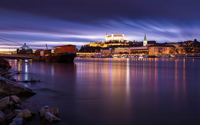
Crooked horizon
It’s a little simpler with a crooked horizon. If it’s a little crocked, correct it. If it crooked a lot, you can keep it. It just look like intention when it’s crooked a lot, and like mistake when it’s crooked a little :)
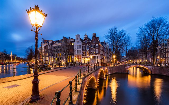
Vignetting
If you are creating a panorama, you really have to remove vignetting. You just want to get the best blend possible. When doing a single photo, it’s a personal decision if you want to remove vignetting or not. I usually leave it be, and sometimes even make it stronger. Having the corners darker and center brighter will bring more attention to
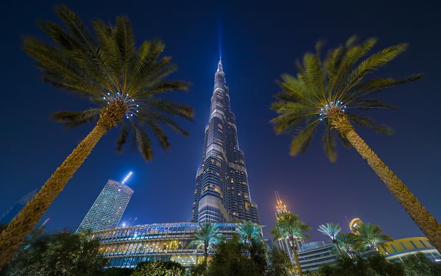
Perspective distortion
Perspective distortions can add to the photo, but also make it much worse. You all seen the effect of falling vertical lines when you shoot up or down. It is very different for every photo, if it is acceptable or not. The distortion can give a sense of scale and make seem things are huge. For instance if you look at an interior photo of a cathedral, without a perspective distortion it looks small and strange. But on the other hand, cityscape shots from far look really strange with a visible distortion.

Ghosting
With ghosting, it depends on what kind it is. If you got ghosting because you did a long exposure shot, I think that quite alright. If you got ghosting because you blended multiple exposures, you should definitively correct those, either in the software you blended the exposures, or afterwards in Photoshop.
Saturated colors
I tend to go by a rule, that If I want to have a strongly saturated color in a photo, I only have one. And it also can’t cover the whole photo. The reason is that there having both stronger and weaker saturated colors will add a nice color contrast, and also give the viewers eyes a place to rest. There are saturated colors in the world, so there should also be in your photos. Just de-saturating everything is not a good approach.
White balance
The importance of white balance changes greatly on the type of photography you do. In portrait and studio photography, this is very important. In landscape photography one can play with the white balance more, as also the light varies much more. Just by choosing to go differently with it, you can give a completely different feel to a photo.